2021 Colors and Palettes of the Year
January 8, 2021
One of the exciting things about moving into one of the new Columbus GA homes from Grayhawk Homes is the chance to put your personal touch on the home through finishes and colors. Best of all, with a brand new home, it’s easier to envision using colors you may not have considered before. You’re in a fresh new home, so why not use fresh, exciting colors and the latest color and palette trends this year. Make the most of this opportunity to branch out. Plus, if you decide it’s not right for you, it’s just paint. You can always change it.
The theme that stands out in the colors for 2021 is one of mindfulness and reconnecting. There are numerous rich tones, as well as calming neutrals that help you create a comforting yet inspiring and encouraging space. We’ve been spending a lot of time in our homes and that may continue a little longer this year, so let your home play multiple roles in supporting you.
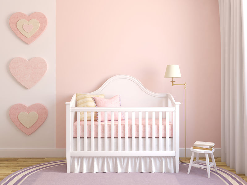
Paint companies are coming up with color palettes that offer a mix of emotions and atmospheres to help you find the right color for each room, while creating an overall sense of connection. For example, HGTV Home by Sherwin-Williams 2021 collection includes colors ranging from a charming blush to a more passionate red. Pale Apricot is a warmer version of the recent pale pinks, while still offering a sense of serenity. This is a wonderful color for a sunlight-filled room and the sweetness of it is beautifully offset by natural fibers, wood accents, and buttery leathers.
On the other hand, HGTV Home by Sherwin-Williams also has Passionate, which takes the warmth of the apricot and turns it into a rich red wine with hints of apricot, but a more even balance between warm and cool tones. This is a color that lets you go bold without going overboard. Use it in an entire room, perhaps offset by crisp or creamy white wainscotting — or even use it for the wainscotting! It also works well as an accent wall, especially to set off some artwork collections. It’s a surprisingly versatile color that adds a touch of excitement without burning out too quickly.
The Pantone Color of the Year is always of interest, and this year, they’ve gone for two drastically different colors that somehow work and find a balance between the seriousness of the times and the hope that still shines through. This year, they’ve chosen Ultimate Gray, a solid, steady color to provide a sense of calm strength. They’ve paired it with Illuminating, a vibrant yellow that is sunny and full of positivity. Gray and yellow have long been design color friends and are worth exploring this year.
Many companies, like Behr, have a variety of color palettes expressing various themes, many focusing on nature and the peacefulness and mindfulness derived from such colors. One great pairing is Jojoba and Broadway. Jojoba is a cool, misty morning with hints of blue and green, while Broadway is a deep, rich color with a touch of subtle eggplant that somehow seems to work beautifully with cooler, green tones. Broadway is one of those fantastic experimental colors that works surprisingly well on bedroom ceilings and framework, matched with the Jojoba, to create a soothing, restful oasis.
For a color with some cool tones, but still a sense of warmth and lushness, consider Graham & Brown’s Epoch. This plum shade is rich and cocooning, but still maintains a slight cool undertone that makes it elegant. Use it in a study filled with rich woods and copper finishes or let it provide a stunning welcome to your home on the front door.
Finally, there’s Sherwin-Williams’ bold yet somehow neutral Urbane Bronze. While dark, it has a hint of its namesake’s bronze lustre and gray tones that bring it up to date. A fantastic accent wall color, especially behind a stunning bed, it can be worked into a variety of rooms, even as a primary color in a living room or study that receives plenty of natural light. Pair it with lush greenery and other organic elements like stone, wood, and natural fibres, and find a balance with clean modern pieces that still have a touch of organic flow in their shapes and/or materials.
These are just a few of the colors of 2021. From deep, dark blues to red desert sands, there’s a wealth of color from which to choose to make your Columbus GA homes feel comforting and inspiring, ensuring that you’ll want to spend time in them and find what you need from them in multiple aspects of your life.
Tags: homes for sale columbus ga, new homes columbus gaCategorised in: 2021 Colors and Palettes of the Year, Design Tips
This post was written by Grayhawk Homes